Gladly
/Head of Design
/2021–2022
/Team of 4
The right information at the right time
Led brand, marketing, and product design at Gladly under one direction, starting with the workspace support agents live in all day.
Clicks to an answer
7 → 3
Products, prices, and order history without leaving the conversation
Usability testing
Won
Zones beat competing directions and shipped as the production workspace
G2
Easiest to Use
Also named Market Leader
Pipeline
5x
Pipeline growth over 12 months after the narrative and go-to-market repositioning
Context
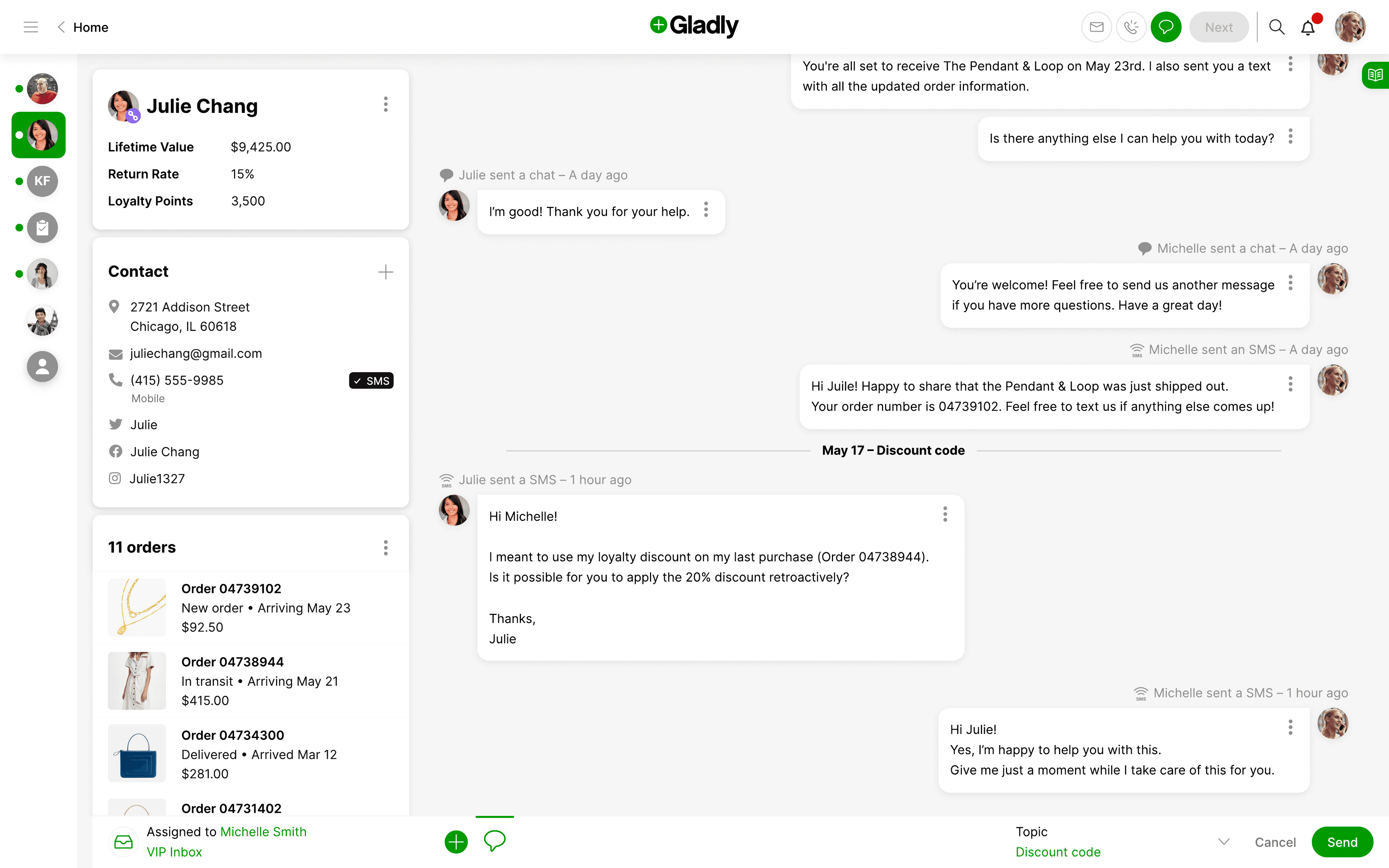
To help one customer, an agent needs three pieces of information: who they’re talking to, what has already happened, and what to do next. Gladly’s workspace held all three, but not at the depth agents needed. Order details sat a level too deep, and agents dug for them mid-conversation while the customer waited.
Gladly is a customer-service platform built on a premise the industry was still catching up to: conversations belong to people, not tickets. Voice, email, chat, SMS, and social all flow into one lifelong thread per customer.
The workspace was where the premise met reality, and it was falling short in a specific way: agents couldn’t see the order and its history at the level of detail the conversation demanded. They could see that an order existed. They couldn’t see what was in it, what it cost, or what had already happened to it. Getting depth meant leaving the conversation. And inside the org, there was no shared way to settle layout questions: every “where should this information go?” debate started from scratch, opinion against opinion.
What I owned
I joined as Head of Design in May 2021 and owned brand, marketing, and product design, three functions that had been pulling in different directions. My job was to bring them under one coherent direction, hiring and managing the design team along the way.
The workspace was where that direction had to prove itself: the surface agents live in all day, and the one buyers judge in a demo.
What I did
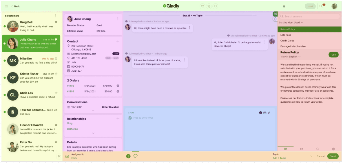
Named the zones before moving the pixels. I introduced a simple model: helping a customer takes three pieces of information: the customer, the conversation, and the answers and actions that resolve it. All three have to be visible at once for an agent to be efficient. “Zones” became the org’s common language for the workspace, and layout debates turned into questions about which zone the information belonged to.
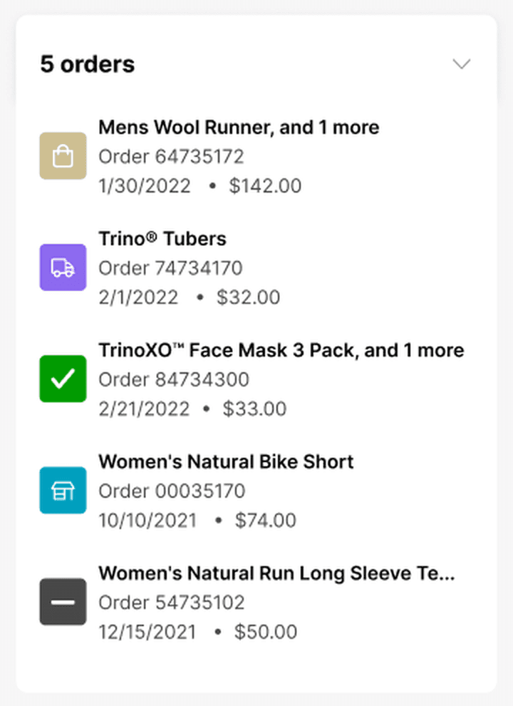
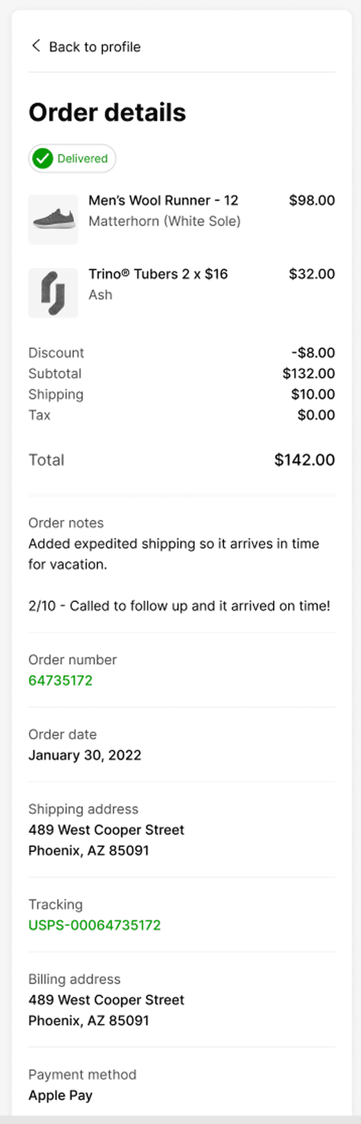
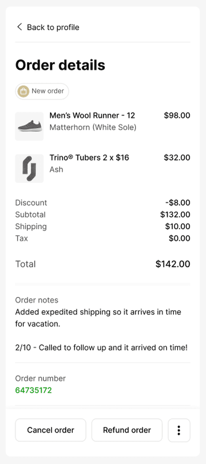
Redesigned the workspace to the model. Customer context (profile, orders, relationships) holds the left zone; the full multi-channel conversation timeline holds the center; answers and actions dock on the right. Order details deepened from a bare order number to products, prices, notes, and history, so nothing essential required leaving the conversation.
Tested it instead of decreeing it. Set up a user research practice the team didn’t have, then put the zones redesign into usability testing against competing directions, won, and shipped as the production agent workspace. The detail views kept iterating through internal feedback until the depth matched what agents actually needed, with products as the focus instead of order numbers.
Told the same story outside the product. Partnered with the C-suite to reposition the product narrative and go-to-market strategy, so brand, marketing, and product made one promise instead of three.
Trade-offs
Visibility vs. depth
Keeping all three zones on screen at once caps how much depth any one zone can show. The compromise was progressive disclosure: a compact order card in the customer zone that opens to full detail in place. Getting that detail hierarchy right took more iteration than the zone structure itself.
A language is a commitment
Once zones became the shared vocabulary, every new feature had to answer to it, and information that straddled zones forced the sharpest debates. That friction was the point, but it made some decisions slower before it made all of them faster.
“Ian’s network effect is remarkable. His team will grow and improve with his guidance. Other groups learn the importance of design and how to best work together. The result is a better product by teams that understand and enjoy the process of building together.”
Joe Ciuffo, Director of Product Marketing, Gladly